
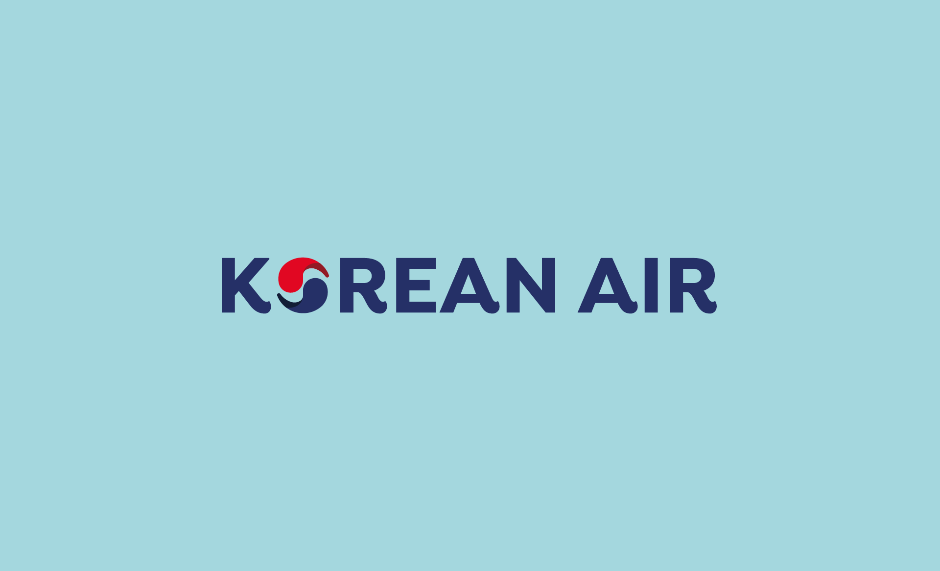
Korean Air
Excellence in flights

WORK DESCRIPTION
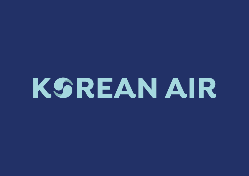
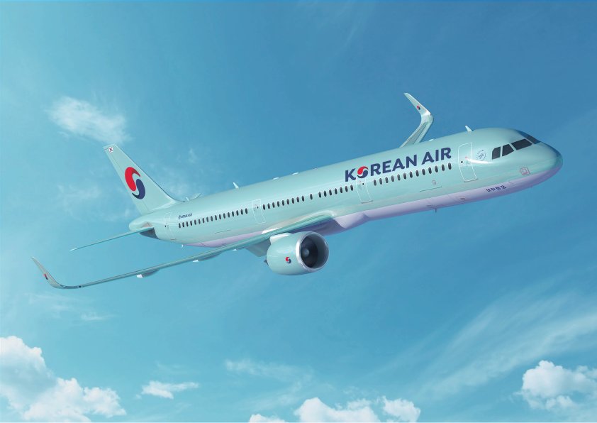
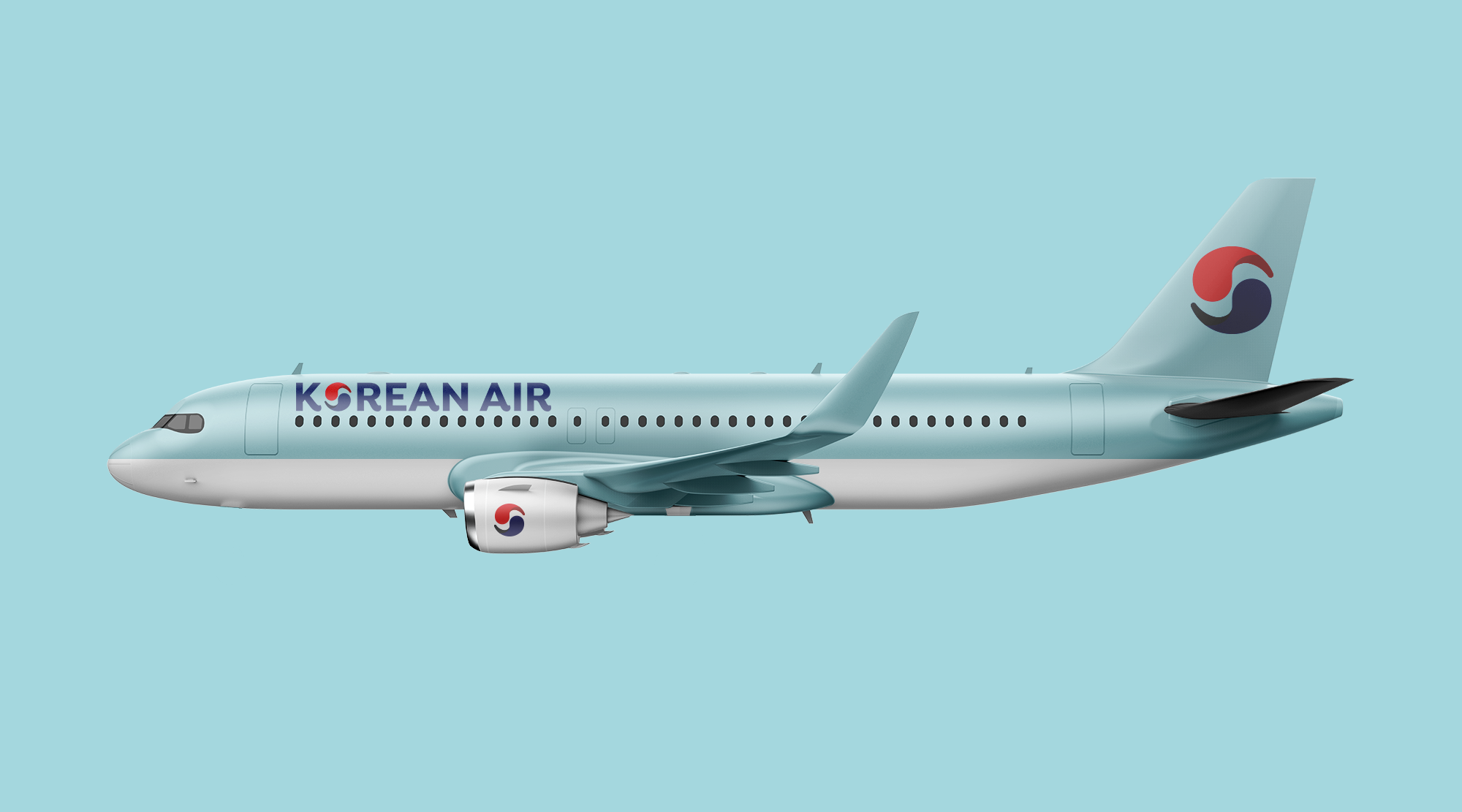
A concept for a rebranding of Korean Air, with colors adjusted to create a more modern and fresh look. The logotype has been updated to a sans serif font, and the letter's end has been refined to incorporate traditional Korean architectural shapes and curves. This creates a harmonious blend of traditional heritage and modern freshness.

more work

sign up
Join the mailing list for insight and updates on our work.
Thank you! Your submission has been received!
Oops! Something went wrong while submitting the form.