
Shanghai M50
Shanghai contemporary art district

WORK DESCRIPTION
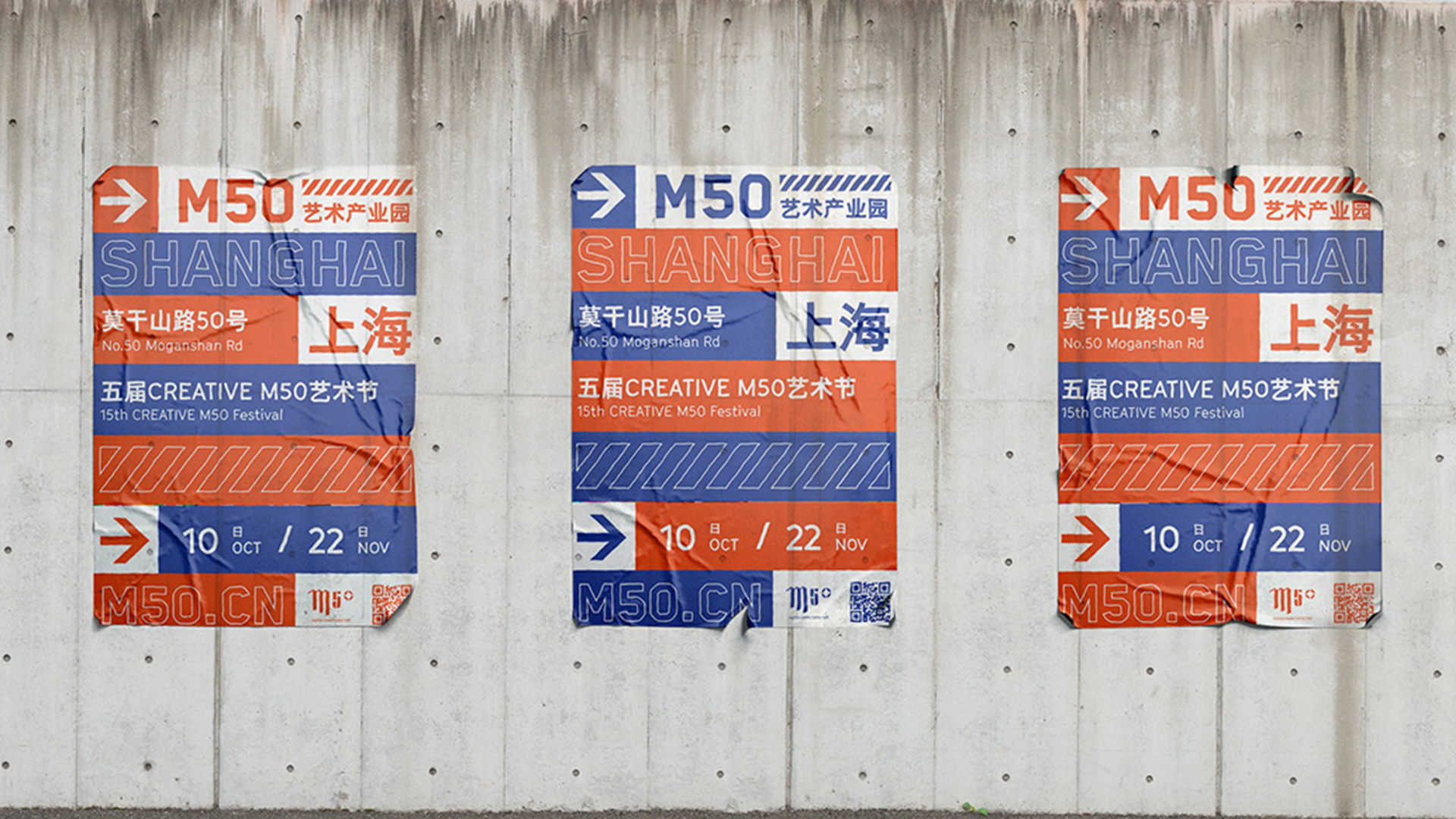
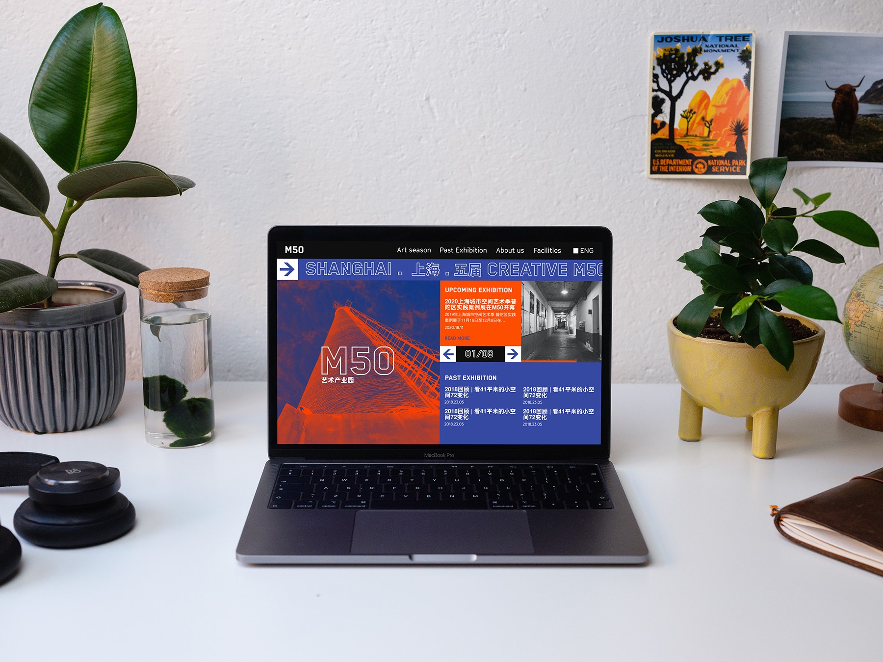
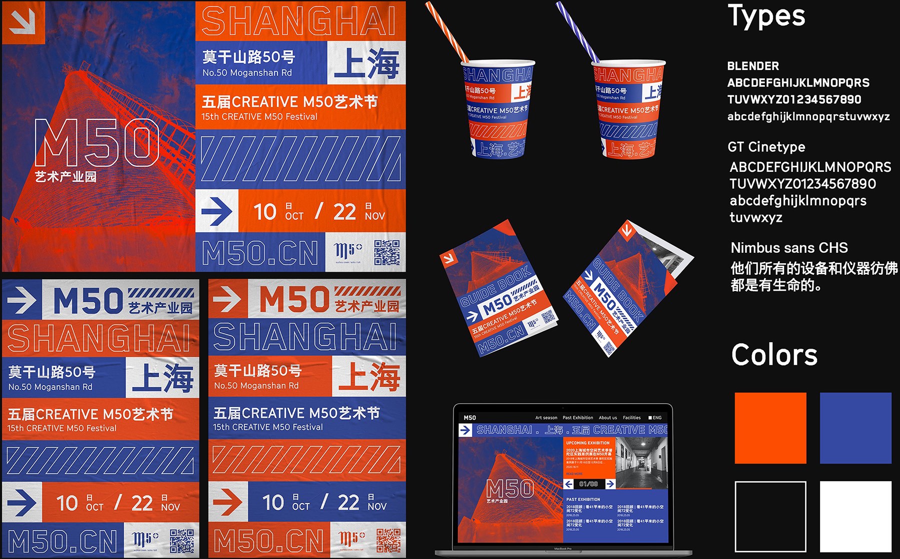
M50 Art Industrial Park, is the largest and most influential creative parks in Shanghai. M50 holds annual art festivals including exhibitions, events and competitions. Reflecting the influential and iconic characteristics that the park symbolizes, this project proposes a new visual identity for M50 Art Industrial Park in Shanghai. The choice of typography is in reference to LED lights in Shanghai streets. The color blue and orange correlation references the mutualism of the digital and natural world. Blue tone depicts the natural world, such as sky, ocean and clouds. In contrast to the blue, orange depicts man-made industrializations such as factories, buildings and construction sights.


more work
sign up
Join the mailing list for insight and updates on our work.
Thank you! Your submission has been received!
Oops! Something went wrong while submitting the form.